kufreu.github.io
repository for geography work and other things completed by kufre u.
analysis of tweets during hurricane dorian using r and postgis
about
RStudio, PostGIS, QGIS, and GeoDa were used in this lab to analyze tweets to see if either a glaringly doctored hurricane map (SharpieGate) or the actual path of Hurricane Dorian drove more Twitter activity.
textual analysis of tweets
This script was written by Professor Joseph Holler and was used to search and download the geographic Twitter data used in this lab using R. This script resulted in two data frames: dorian, which contains tweets about Hurricane Dorian, and november, which contains tweets with no text filter that were made in the same geographic region as the tweets. The dates when the tweets were searched can be found on the script. The status IDs for these tweets can be found here and here.
After this was done, further preperations were made to analyze the tweets. It was first necessary to install these packages and load them into RStudio.
install.packages(c("rtweet","dplyr","tidytext","tm","tidyr","ggraph", "ggplot2"))
The text of each tweets was first selected from the data frames and then words from the text.
dorianText <- select(dorian,text)
novemberText <- select(november,text)

dorianWords <- unnest_tokens(dorianText, word, text)
novemberWords <- unnest_tokens(novemberText, word, text)
The stop words were then removed from these objects through these steps.
data("stop_words")
stop_words <- stop_words %>% add_row(word="t.co",lexicon = "SMART")

dorianWords <- dorianWords %>%
  anti_join(stop_words)

novemberWords <- novemberWords %>%
  anti_join(stop_words)
I then graphed the count of the unique words used in the tweets using ggplot2 having removed the useless words.
dorianWords %>%
  count(word, sort = TRUE) %>%
  top_n(15) %>%
  mutate(word = reorder(word, n)) %>%
  ggplot(aes(x = word, y = n)) +
  geom_col() +
  xlab(NULL) +
  coord_flip() +
  labs(x = "Count",
       y = "Unique words",
       title = "Count of unique words")
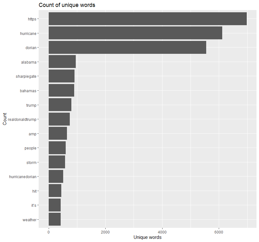 Excluding https, which should be added to the list of stop words, hurricane and dorian unsurpsingly appear the most in tweets. Alabama, the focus of SharpieGate, lags behind these two, though was still used more than what brought about its increased use. Word pairs were then made and graphed using ggraph.
#### creating word pairs ####
dorianWordPairs <- dorian %>% select(text) %>%
  mutate(text = removeWords(text, stop_words$word)) %>%
  unnest_tokens(paired_words, text, token = "ngrams", n = 2)

novemberWordPairs <- november %>% select(text) %>%
  mutate(text = removeWords(text, stop_words$word)) %>%
  unnest_tokens(paired_words, text, token = "ngrams", n = 2)

dorianWordPairs <- separate(dorianWordPairs, paired_words, c("word1", "word2"),sep=" ")
dorianWordPairs <- dorianWordPairs %>% count(word1, word2, sort=TRUE)

novemberWordPairs <- separate(novemberWordPairs, paired_words, c("word1", "word2"),sep=" ")
novemberWordPairs <- novemberWordPairs %>% count(word1, word2, sort=TRUE)

#### graphing word cloud with space indicating association ####
dorianWordPairs %>%
  filter(n >= 30) %>%
  graph_from_data_frame() %>%
  ggraph(layout = "fr") +
  # geom_edge_link(aes(edge_alpha = n, edge_width = n)) +
  # hurricane and dorian occur the most together
  geom_node_point(color = "darkslategray4", size = 3) +
  geom_node_text(aes(label = name), vjust = 1.8, size = 3) +
  labs(title = "Dorian Tweets",
       subtitle = "September 2019 - Text mining twitter data ",
       x = "", y = "") +
  theme_void()
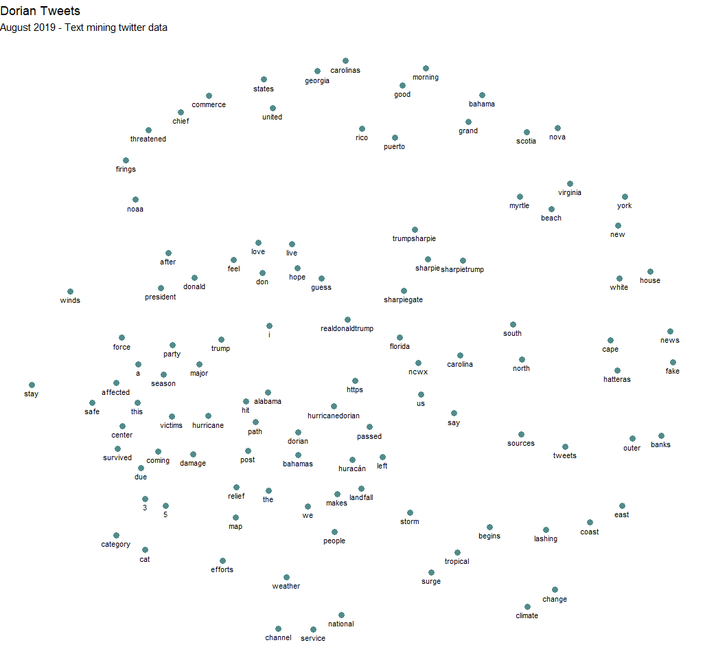 This should be corrected to Septemeber 2019
The complete script for this analysis can be found here.
uploading data to postgis database and continuing analysis
After using R and RStudio to conduct a textual analysis of the tweets, the tweets and downloaded counties with census estimates were uploaded to my PostGIS database using this script. The counties were obtained from the Census using a function from TidyCensus.
Counties <- get_estimates("county",product="population",output="wide",geometry=TRUE,keep_geo_vars=TRUE, key="woot")
With the the data frames uploaded to the database, more preparation was done in order to make a kernel density map of tweets and a map which shows the normalized tweet difference index of each county in QGIS. The SQL used to prepare the data can be found here. In essence, PostGIS was used to spatially join the tweets to the counties and to calculate the number of tweets per 10,000 people and the normalized tweet difference by county. The formula for the NDTI was (tweets about Dorian - baseline tweets)/(tweets about Dorian + baseline tweets). The November tweets were used a baseline.
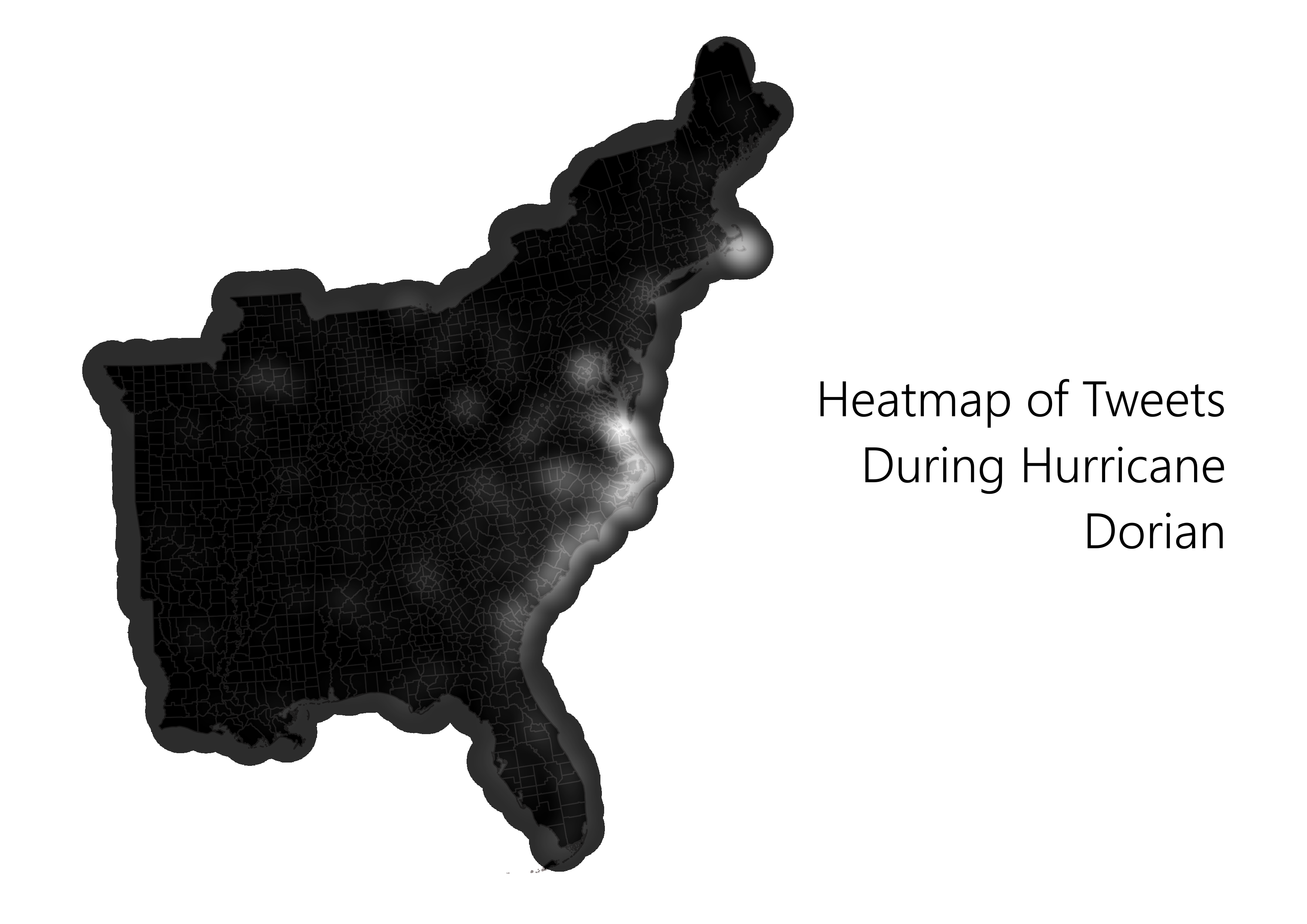
 Both maps are incorrectly titled!
spatial statistics with geoda
After the heatmap and NTDI map made in QGIS and the data prepared with PostGIS, GeoDa was then used to conduct spatial statistics. I connected to my database through GeoDa and loaded the counties table into the program. I then created a new weights matrix using geoid as a unique ID and setting the variable to the tweet rate a caluclated in PostGIS. Finally, I used GeoDa to calculate the local G* stastistic, the results of which can be seen in these two maps.

 Predictably, these maps show that the amount tweets made along the East Coast is statistically significant.
brief interpretation
Despite the President’s claims that the course of Hurricane Dorian was set towards Alabama, the maps have made it apparent that most Twitter activity was focused along the true path of the storm. Although Trump was unable to greatly influence the location of tweets, he was, however, able impact the content of tweets. This can be seen in the count of unique words where Trump, his Twitter handle, Alabama, and SharpieGate were the most used words after Hurricane Dorian as well as in the most used word pairs.